Process
First of all, I wanted to meet their user persona, Laura. Although I didn’t know if she was a new user, or not, I wanted to figure out her possible gains and pains when she was surfing at Colvin and find out what could I improve to give her a better experience.
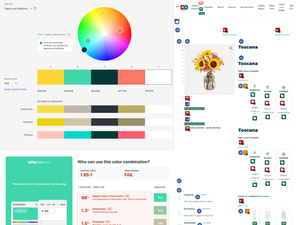
Then, I analyzed the actual product page (app and web) to check the accessibility and I try to detect errors to solve or how to improve it.
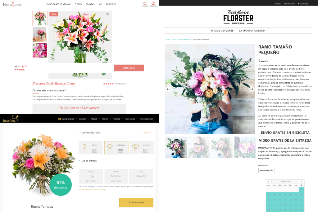
I also studied the competitors, what were they doing, and see if I could take advantage of any feature that I could apply to the product page, and realize what I didn’t want to do.
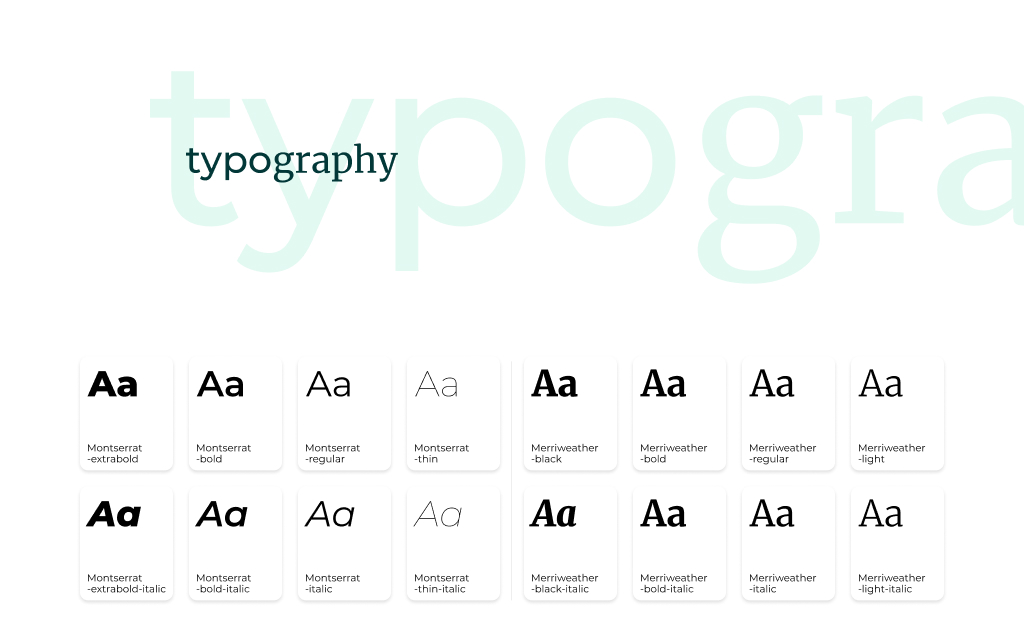
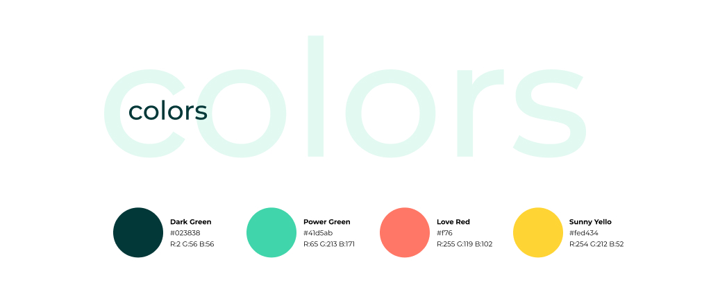
I also analyzed their styleguide to create my own library (fonts, styles, colors, measures, icons…) to develop a design system that was going to transmit that sensation of consistency that I missed in both Colvin platforms, web, and app.
Having in mind how to increase the conversation rate to the checkout, I redesigned the mobile web product page basing me on the content I found on the app and the mobile web.
Reaching the goal
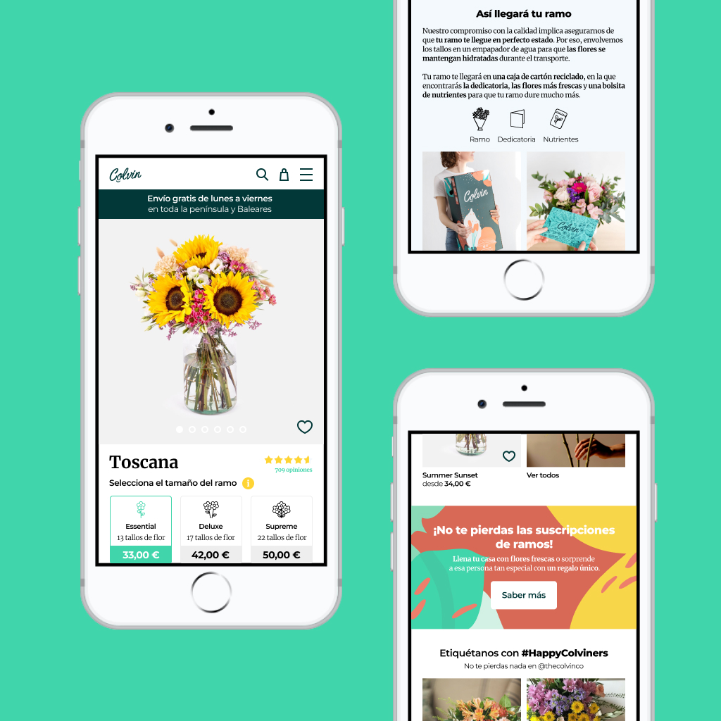
Header section
I redistributed some menu items and add a shopping cart and search icons.
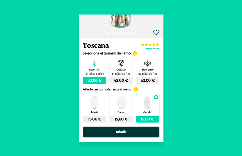
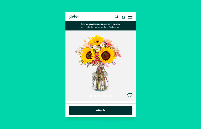
Product section
I redesigned or/and added: shipping bar, heart icon (favorites), rating (valuable and determinant for users), access to more information, selections by default, selector test proposal (although I didn't have data to consider this option), cart button behavior, update icons and properties data, softer color palette, displayed items...
The rest
If Laura arrived here, it was because maybe she wanted to explore more bouquets. Now they are displayed in 2 columns and there's a category banner. There's also the subscription banner, Instagram pictures (offer, offer, offer…), help section has been restructured, highlighted the download app, and modified the structure of the footer section.
Micro-interactions
I prepared two samples of animated elements to be used on the product page.
Bouquet size selector:
“Add to cart” button behavior
Also, I prototyped a simple interaction to view the selector (a proposal, test a/b). You can have a look on the following link.
Measurement and iteration
All that said, the only way to know if my proposal worked better than the previous design was with tests and metrics. Obviously, my proposal should increase the conversation rate, which was my final goal, and check if I had reached it.
Also, don’t forget about Laura: how to empathize with her and her needs. Check if the proposal worked better: is it more efficient or do I have to improve more processes? (on the product page, at the checkout… metrics, metrics, metrics!) And also, I could test a prototype with real users and know their feedback before any development or release.